Visualize optimization results
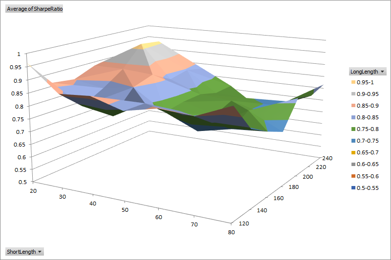
The default optimization report has a filter enabled on the header row to easily sort and filter different parameter combinations. A surface chart can be helpful to visualize the interaction between two different parameters at a glance. For example, using data from the example in Optimization, we can plot the Sharpe Ratio with respect to the short and long moving average lengths.
To create surface charts automatically from an optimization report, place the macro below within your Excel Personal Macro Workbook and assign a hotkey.
Public Sub CreateSurfaceChart()

    Dim r As Range
    Dim ws As Worksheet
    Dim pivot As PivotTable

    Range("A1").Select
    Range(Selection, Selection.End(xlToRight)).Select
    Range(Selection, Selection.End(xlDown)).Select
    Set r = Selection

    Set ws = Sheets.Add
    ActiveWorkbook.PivotCaches.Create(SourceType:=xlDatabase, SourceData:= _
        r, Version:=xlPivotTableVersion14).CreatePivotTable _
        TableDestination:=ws.Name & "!R3C1", TableName:="PivotTable1", DefaultVersion _
        :=xlPivotTableVersion14
    ws.Select
    ws.Cells(3, 1).Select

    Set pivot = ws.PivotTables("PivotTable1")

    With pivot.PivotFields(1)
        .Orientation = xlRowField
        .Position = 1
    End With

    With pivot.PivotFields(2)
        .Orientation = xlColumnField
        .Position = 1
    End With

    pivot.AddDataField pivot.PivotFields("Sharpe Ratio"), "Average of SharpeRatio", xlAverage

    ws.Shapes.AddChart.Select
    ActiveChart.ChartType = xlSurface

    Set r = ws.Range(ws.Cells(3, 1), ws.Cells(3, 1).Offset(pivot.RowFields.Count, pivot.ColumnFields.Count))
    ActiveChart.SetSourceData Source:=r

    ws.Shapes(1).Top = 50
    ws.Shapes(1).Left = 50
    ws.Shapes(1).Width = 600
    ws.Shapes(1).Height = 400

End Sub